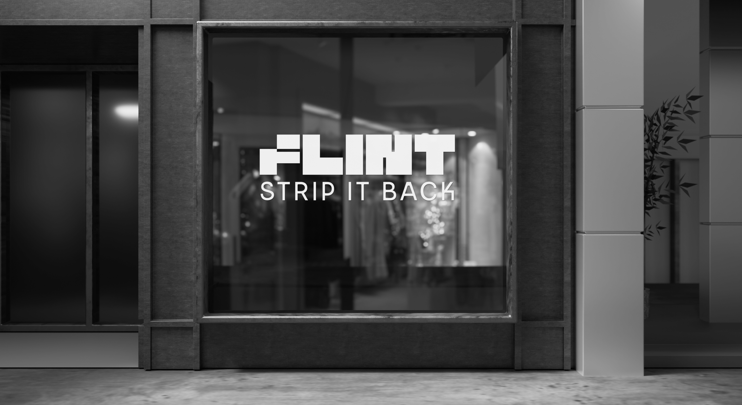
Made as: Kankei Studio
Flint
A complete brand strategy and visual identity for Flint, a luxury bioscience skincare brand built on radical simplicity with a gender-neutral, four-product range.
Role
Brand Designer
Project Scope
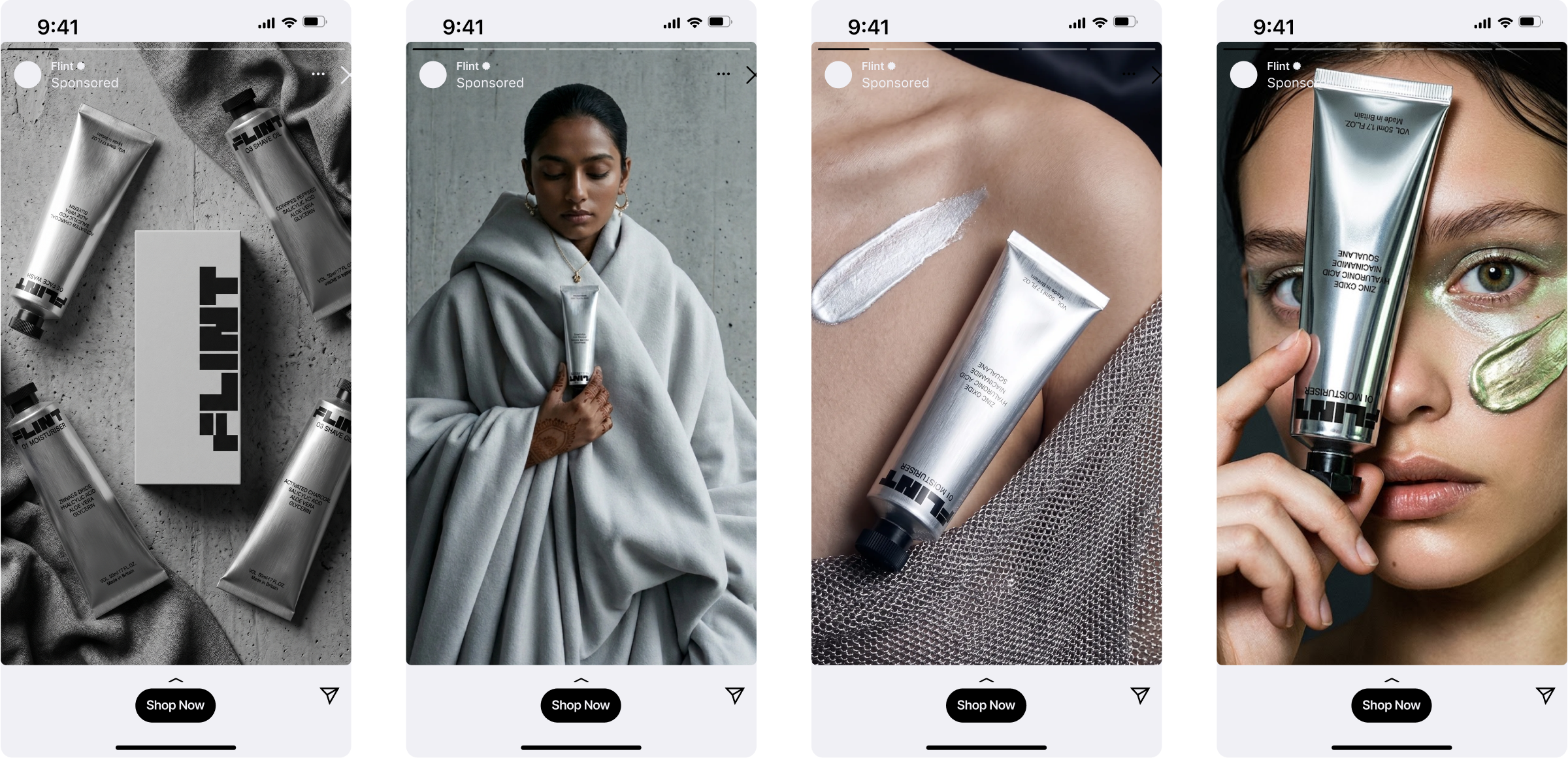
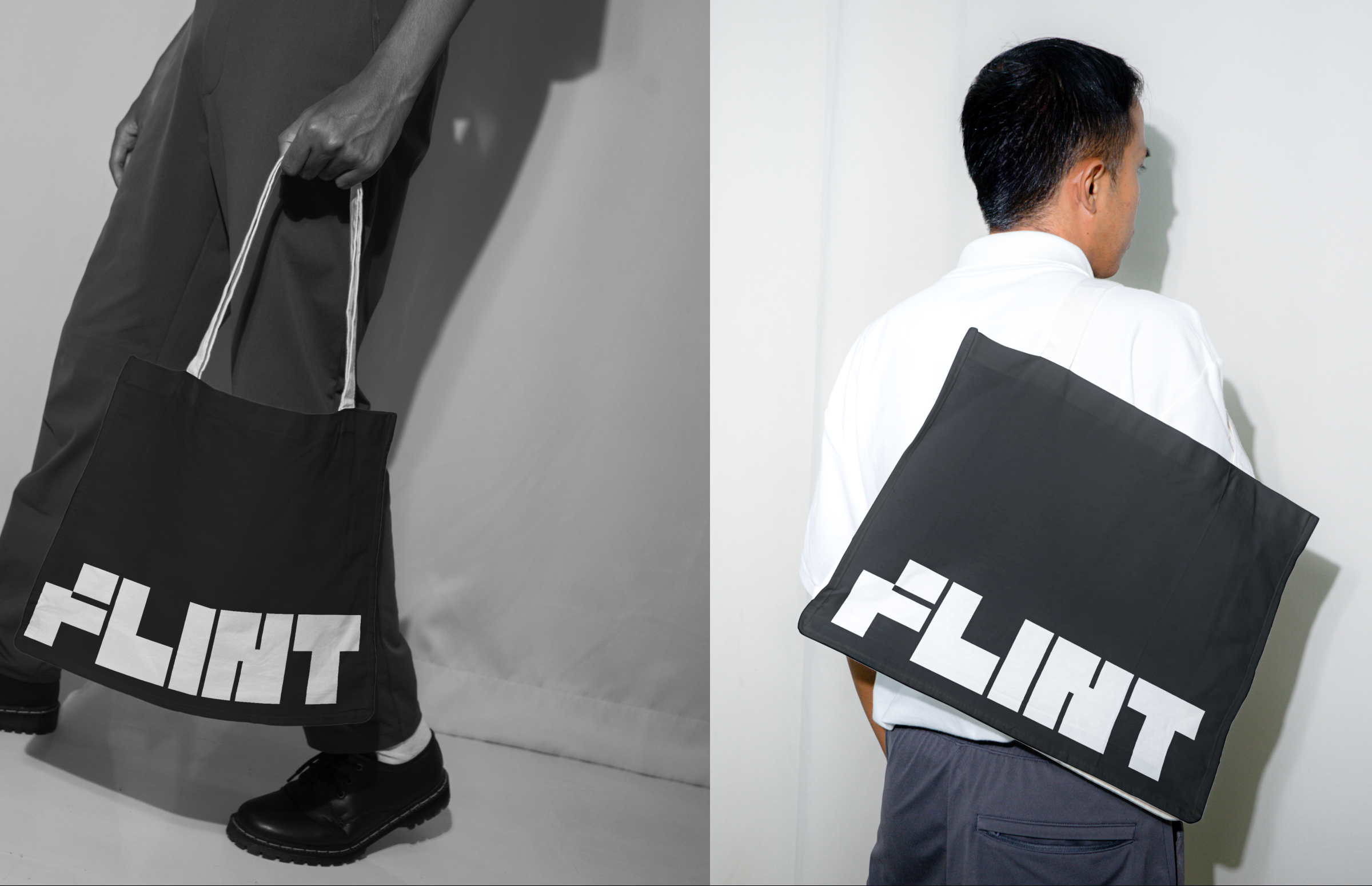
Flint required a full brand strategy — covering positioning, brand voice, messaging hierarchy, and the visual and verbal framework that holds everything together. From that foundation, the project extended into art direction: defining the photographic world, material language, and the visual logic that runs across every touchpoint, from packaging to digital presence.
Design Intent
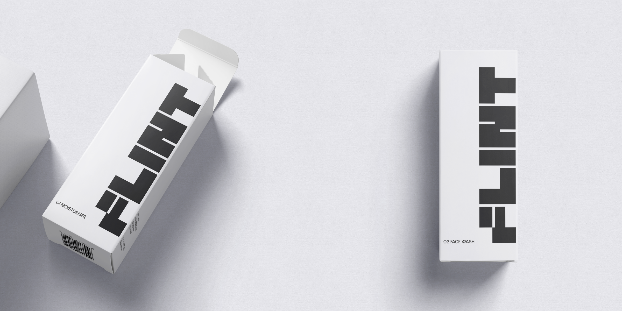
Stripping everything back to let form and formula speak for themselves. Raw, undecorated aluminum packaging meets minimalist, concrete art direction so nothing competes with the product.
Outcome
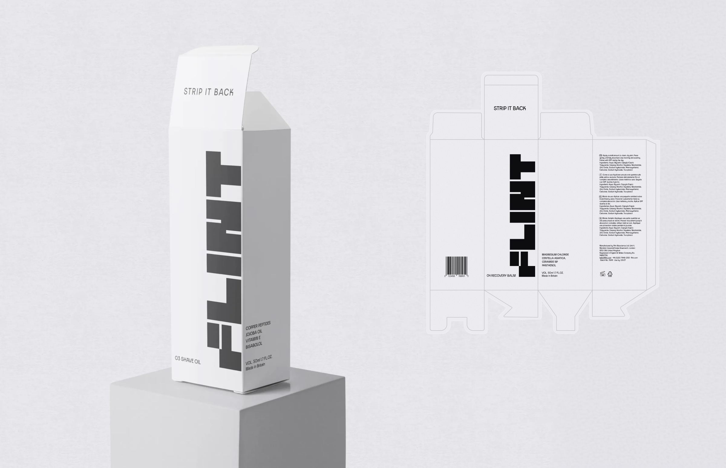
Delivered a full brand concept, four-product packaging system, and editorial direction, successfully positioning Flint as an entirely new category rather than just another skincare product.



The Flint logo leans heavily on a grid system, just like the rest of the brand
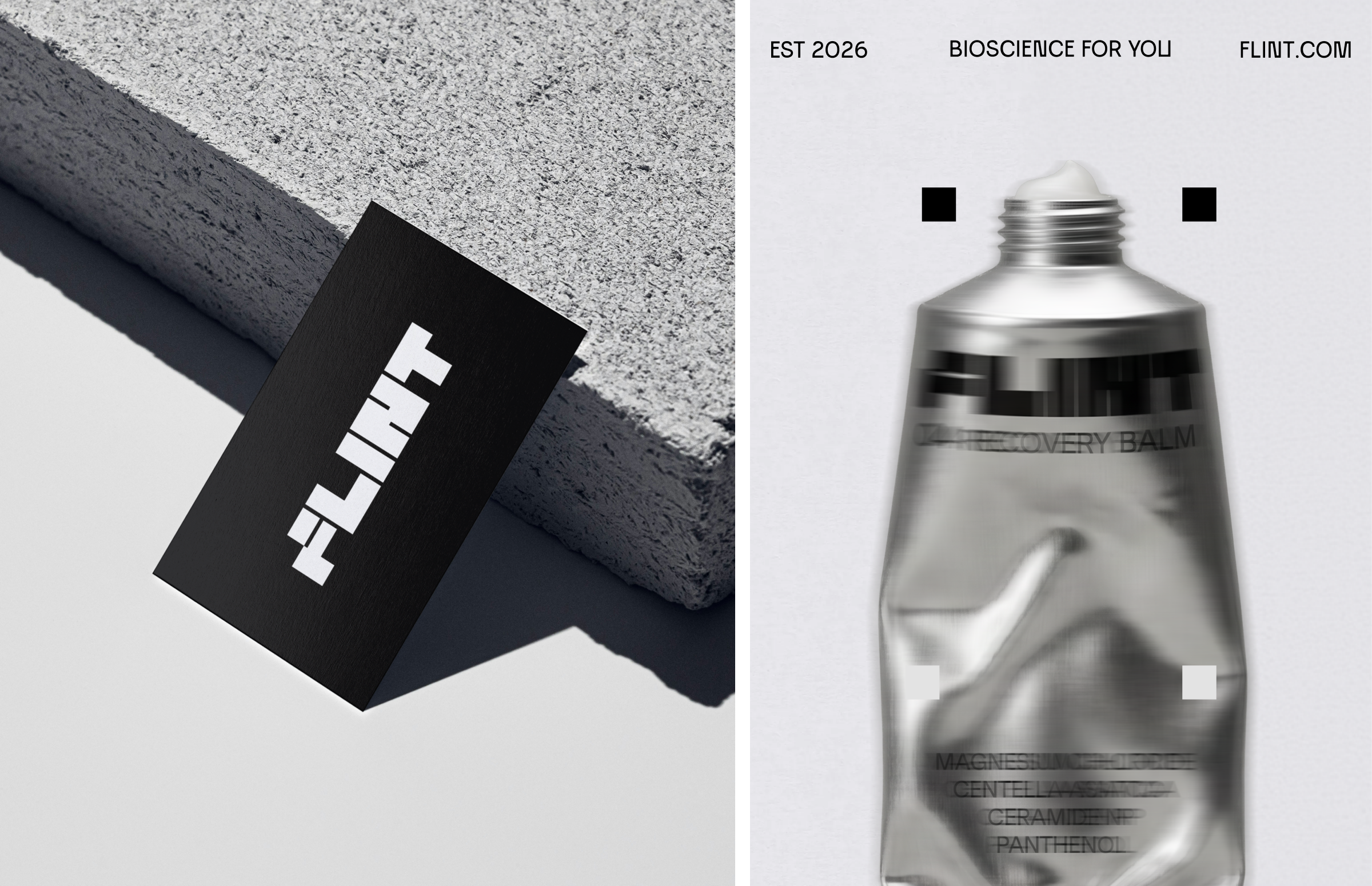
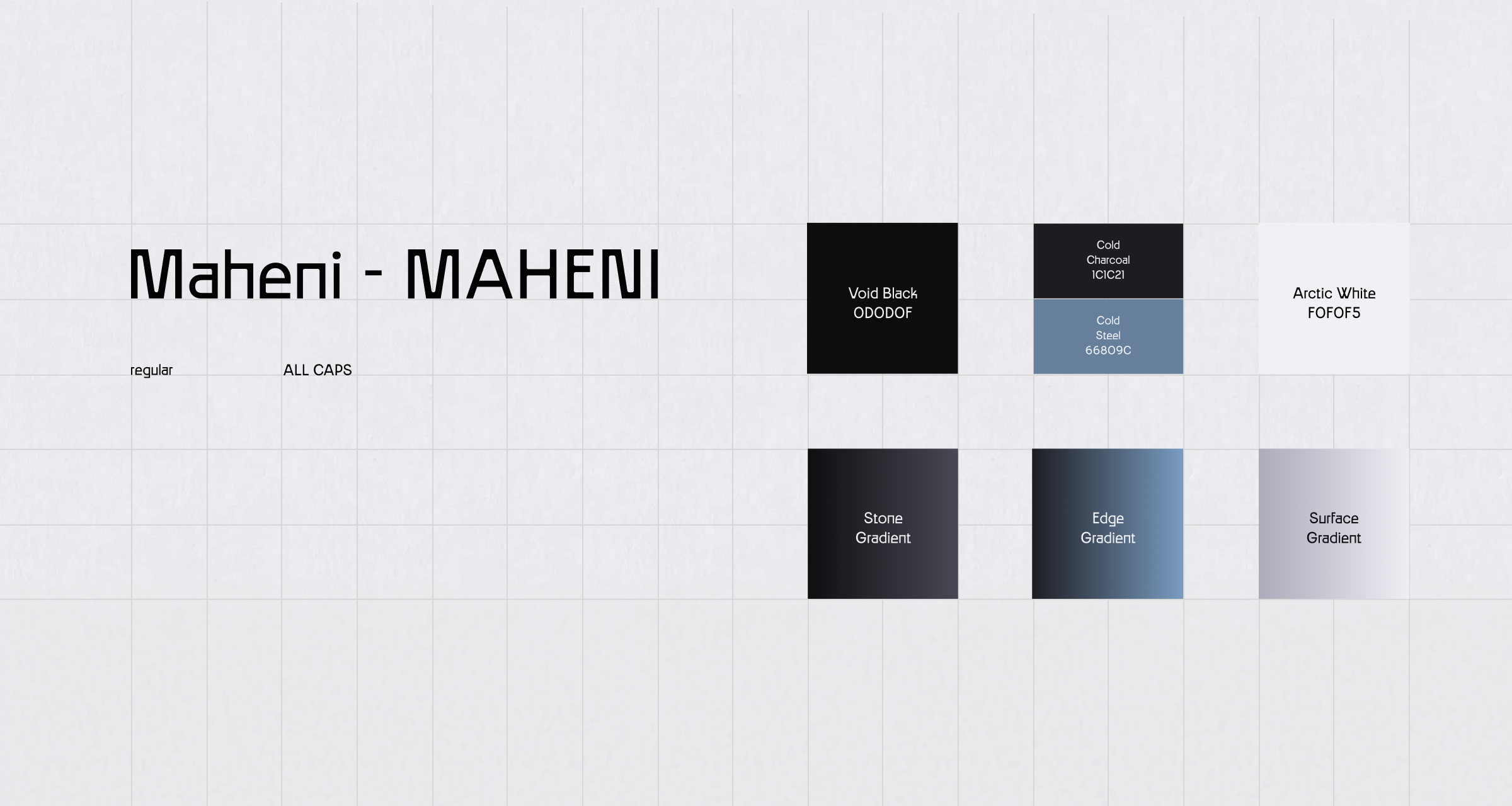
The grid system is built on a base unit of 5 — scaling in multiples of 5, 10, 15, and so on. The same logic applies to columns, margins, and rows, all of which use 5 as their starting point.
Void Black and Arctic White lead in all contexts. Cold Charcoal and Cold Steel support through depth and layering. Stone, Edge, and Surface gradients are reserved for backgrounds and large format use only.

(About)
Flint is a luxury bioscience skincare brand built around radical simplicity and biological optimisation. Not men's, not women's, for anyone who takes their biology seriously. The brand philosophy is singular: we don't add ingredients, we remove them. Four products, four ingredients each, nothing unnecessary. Every decision, formulation, packaging, distribution, is made by subtraction, not addition.